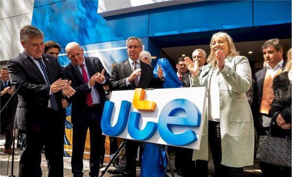
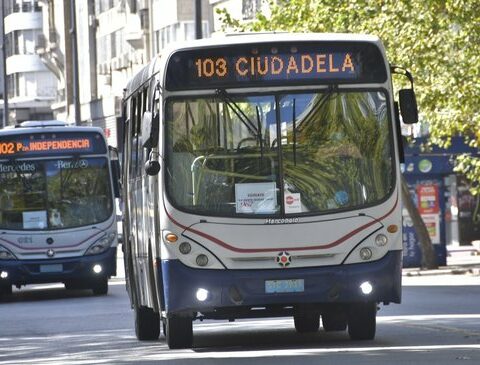
In the last edition of the Expo Prado last September UTE presented its new institutional logo. The new image was first included in the company’s digital channels, and will gradually begin to be seen on printed invoices, commercial offices, the vehicle fleet and the uniforms of its workers.
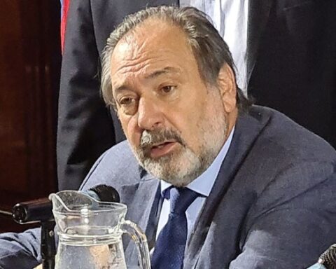
The renewal of the image occurred after 31 years, and according to the president of UTE, Silvia Emaldi, it is framed within “the new commercial policy” that is being developed and whose central axis is “to be closer to each of the clients”.
“They seek to transmit the process that the company has been carrying out in pursuit of the decarbanization of the matrix, the approach to each of its clients and a more intelligent management of the networks. Ultimately it is show and transmit the closeness with the client of a public service that has to be available 24 hours a day, 365 days a year and with adequate quality,” he said weeks ago in an interview with The Observer.
How much did the new UTE logo cost? For this change, the electric company paid $1,770,000 plus VATabout US$ 50,500 at the average exchange rate for the period 2021-2022 when disbursements were made for the three stages of the work, according to information accessed The Observer following a request for access to public information.
Emaldi had explained that This expense is framed within the communication budget that the company has in force and that currently amounts to $70 million annually (approximately US$1.7 million). This category includes advertising spots that are usually produced, sponsorships and advertising in the media, among other contents.
From upper case to lower case
The new image was in charge of the communication agency DDB Uruguay which has a current contract with UTE and provides institutional communication advisory services, after winning the last bidding process in 2019.
The “visual identity revitalization” project was entrusted by DDB Uruguay to the agency Crossing dedicated to strategy and design.
As Cruce explains on his website, the main design challenge was that the new identity “It was aligned with the values and the current and future business vision of UTE, something that was not happening after decades without being updated.”
Company logos.
Another of the central premises was that the new logo “coexist harmoniously with the other state brands”. This led, for example, to maintaining blue, which is associated with national symbols, along with orange, which has been historically used by the entity in its visual identity.
Also, it was decided to go from uppercase to lowercase letters in the acronym of the logo “to communicate the closeness that the entity has with its different audiences”.
“The gesture of the letter t, in addition to giving it pregnancy, adopts a leading role since from it a framework is created that becomes key and distinctive of the entire projected identity system”says the agency on its website.
trade policy
What does it mean to “be closer to customers”? According to Emaldi, it is “finding tools and better solutions”. By way of example, she mentioned andl social inclusion plan that was “enhanced” with the social bonus for energy.
In relation to residential customers, the president of UTE said that the smart rates -double and triple hours- that existed since 1993. “They had only 74,000 customers and today there are more than 212,000, with a 20% monthly rate reduction on average,” he argued.
Emaldi added that they have arranged special rates for sectors such as dairy and other productive activities that demand the intensive use of irrigation. And also for large industrial consumers with “regulatory adaptations”, in reference to the free client plan. “That has been criticized but we are going to continue,” he said.
On the other hand, he said that the new commercial policy “seeks to continue promoting” the use of the different service and communication channels, such as applications, WhatsApp and a previous schedule for office service. This together with the installation of smart meters which today reaches more than 832,000 services (50% of customers), which allows, for example, to automate readings every 15 minutes, as well as actions to change rates, power and remote electrical reconnection.
The president of UTE added that in parts of the territory where there are no commercial offices, they have implemented remote points of tele-commercial attention by video call (totem) that work in El Correo offices. By the end of the year there will be 37 in operation in small towns. The company also plans to install service points in different malls in the country.
“They were 31 years with an institutional image. It deserved to be changed,” Emaldi said.
Bills, vehicles and uniforms
According to the company, the change of the logo and the graphic system in everything that is digital “It does not imply associated costs”, because it is carried out by company programmers.
In printed materials such as invoices will be used first all those that are available in the company’s warehouses with the previous logo, and when that stock is finished, the new invoices will already come with the new logo “so there will be no additional costs there either.”
In the case of the uniforms used by officials, when the new ones must be made – they are changed every two years – they will already have the new logo.
Y on buildings and vehicles of the company, the change of the logo will also be gradual, “when it is necessary to intervene in said places due to building adjustments or change of vehicles or due to wear of the plotted material carried by the trucks,” it was explained.

