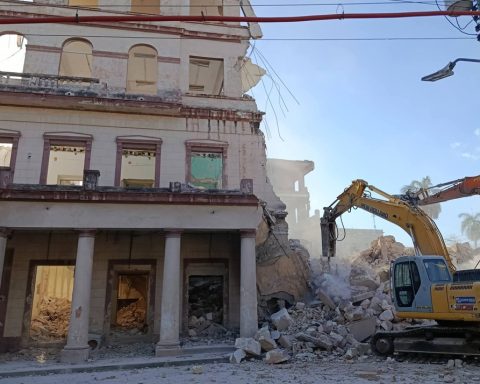
For a long time I wanted to comment on how some unspeakable logos, valued from a certain angle, acquire an unexpected decorum. Horrible naturally. But as banners of the horror that engenders them, they reveal a majestic glimpse. So they give disaster a face… in a disastrous way. Would a better conceived logo be more appropriate? It is an interesting question.
These are not texts for professionals, but for those interested and curious. So to understand why we produce so many logos it is not necessary to get bogged down in hirsute theories. Why are some good and others not so good? It is not easy to make it clear. Design theories —like all of them— have become clogged with abstractions over the years. Three or four central ideas are rewritten over and over again. Theorists who write for theorists or for enthusiasts of cryptic language become almost incomprehensible.
A logo is hardly more than a proper name. Let’s take any name. Rigobert. What can this name tell us? Well, a considerable amount of more or less pertinent information. It represents a man, Latino, of a certain age. Yornel, for example, the same, but younger. Our internal processor will try to find other resonances. How many Rigobertos have we come across before? What does the name evoke? How do we feel when interacting with a Rigoberto? Half naturally lost… but very far from informative nothingness.
Names —or surnames— like Gucci, Chanel or Lacoste make us clearer and more satisfied. We understand more or we think we understand. We have confronted them countless times. They are not more sophisticated than the Rigobertos and the Gutiérrez of life… They have only been treated differently. They have been logotyped and have multiplied and spread everywhere. Some are even accompanied by symbols. In addition to identifying a brand, they represent “a” way of assuming existence. Certain “values”. The phrase: “I’m more Gucci than Lacoste” makes all the sense in the world.
A good logo must provide the greatest possible amount of certainty, or illusion… A good symbol, the same. It may be then that from a somewhat dissident or subversive point of view —and I’m not talking about politics— a “horrible” logo can honestly represent “horror”. But for them it will be necessary to put aside the dramatic illusion. Leaving aside ideals and utopias, and this is very difficult.
The logo of the Provincial Book and Literature Center (of) Havana in its own way is a work of art. There is no better way to visually summarize what it represents. From that point of view it seems sublime and even unbeatable. You have to see how the symbol allows us to see what at the same time could be a succession of books and leaves or the leaves of a book that come off and fly with the wind. Winds as effects of ancient and recent causes. That poster is almost divine because if Nature were able to create a space like that—which is all it shouldn’t be—the unconscious patterns of development that it created over so many geological ages, refined through trial and error over thousands of millions of years, would inevitably arrive at this logo. That is why I consider it a museum logo. That is why we should preserve it for future generations. And for those who will discover in a few centuries our island buried in the most boring dust in the solar system.
The New World logo is more abstract. But it does not fail to offer magnificent subtleties. This new world takes as its starting point nothing less than the year 1926. Very unique for many reasons. In October, one of the most powerful hurricanes in living memory hit western Cuba, leaving disgrace and desolation. Among so many things, the flood carried away everything that Moses Simons had written up to that moment. The one from “El Manisero”. The future leader of the Cuban Revolution was two months old.

If you notice, the enclosure of the new world evokes the bestial flood. The water that almost covers the windows. The gray reminds us of the height that the waters reached. Fantastic. In the logo, the syllables “nu” and “do” are underlined. Knot. What more has to do with the concept of traffic jam than with the mythical design group formed by Blado and Marín.
In my opinion… they are very bad logos that, observed in another way, are very good. When they are appreciated in this way, they grow and reflect their circumstances like few others. Design, like everything in this life, beyond what it considers itself, will tell the story of its time and the priorities of its consumers. Over time, you will be evaluated taking into account factors that say very little today. The world we see, as we hinted at above, unfolds on unavoidable configurations. Like the Fibonacci sequence that the hermetic and conspiracy theorists like so much. Such logos sprout from these environments because it probably could not be otherwise. Perhaps they are perfect and strange logos such as caterpillars, sea urchins, squids. Weird, ugly, perfect… who knows.