He was concentrating on commenting on a couple of logos in the area, both located on 67th Avenue. And I’m going to do it, there was more to it. The curious thing is that a flood of photos of a couple of nonsense has come to me from Havana, so that I can give them a little review. We’ll do it next week. It feels great that they remember me when they find them, take pictures of them and send them to me, consuming their megabytes. I do not forget that the text belongs to the one who reads it, who decides what is and what is not, as much as the one who writes it. The rest is literature. Above all things because what we see on the Island is unrepeatable. Like visiting a Jurassic park. And we are precisely talking about it, the echo of a space and time so far from reality, of the life that it shares with almost all the nations of the same planet, that it seems that they are diverted to another dimension, to a parallel world in which The earth goes around the sun every 32 hours of 75 minutes.
But today I start with a little corner that reminds me of my own. A Latin corner. His logo represents a steaming cup of coffee. The smoke does not stand out for being subtle and elegant. Its vapors look like question marks escaped from caffeine hell. In relation to the categorical geometry of the cup they walk on their own, more visible and notorious, by a long way. Because of its thick strokes and because of the space they occupy in the identifier. They say that the “Rinconcito” sells smoke? I don’t think so. In these parts, the food always arrives generously in portions that are often doubled. All things considered, it is a logo —in its entirety— that would not be noticed in Havana or San José de las Lajas. As far as design is concerned, it has not crossed the Rio Grande.
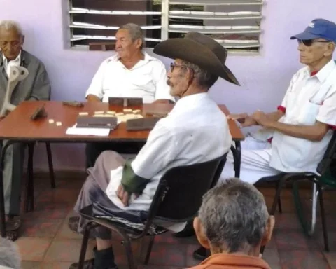
The same designer possibly made the logo of the Coral West – Adult Day Care: The best self-reported elder care provider in Doral, Miami Gardens, Hialeah, Miami, Weston, and Kendall. A simple coral crowned the C. And it seems that he came with his hat to the typographic queue to ask what they got at the stall. What they are beautiful are the blue ones. A relaxing combination, very coral… extraordinary to sell fish tanks. It is difficult for me to see in the poster something that reminds me of the elderly, or the services and attention they deserve. Another proposal that hardly attracts attention in the peripheral municipalities of the Cuban capital.

I want to dwell on the latter. Miami Acupuncture. It doesn’t seem to come from the same designer. Without being good, he has much more, he takes us by the hand to where he thinks we will be more comfortable. His pet is a chubby Buddha, with a somewhat sinister expression: he carries in his raised hands —above his head— his pair of shoelaces. He overwhelms the impulse that he wants to give them to stick them in the back of the sufferer. He frightens the enjoyment with which he seems to anticipate it. He arouses suspicion by standing on the dark side of Yin and Yang, on the dark side of balance. A messenger of evil, chaos or disease.

No iconography was spared here. A reclining victim was added to the logo, offering more than just his back to the Acupuncturist Buddha. It is noted that the styles of both images are each on their own. Although the patient has practically resolved with a valued continuous line, the buddha is lavish in detail. It didn’t take long for us to realize that they are two logos together. Perhaps they are the two proposals of the designer and the client did not want or did not have time to decide on one of them. What is clear is that there is a lot of work done… effort and a minimum of meaning floating throughout the space.
None of these examples has enough substance to dedicate an entire text to them. As a whole, they give an idea that in some stratum of local communication we share the same “weaknesses”. And it is not as simple as comparing them conceptually and formally. The differences, to which we will be pointing, are more in the commitment to the practical result. For decades a logo conceived in Havana was an end in itself. It served to demonstrate his own achievement and the culmination of a distinguished task, almost a mission oriented from the pantheon of infallible ideas. The creation and emplacement were the event itself. On this side of the river, the logo joins those who pull the cart. Getting it out of the mud is to be successful in selling the product or service. At least that’s how it is seen from a great height and squinting. Of course there will be plenty of examples that contradict what we are saying. They are the exceptions that prove the rule.
Next Thursday we will see two mummies recently recovered from the desert. Hot sand breaded. divine