CDMX, Mexico. – If you ask the expert baseball editors of the influential site The Athletic Regarding the aesthetics of the Cuban uniforms used by the athletes of the Island in the V World Classic, the answer is not very favorable.
Major League Baseball section writers and editors from this specialized page came together to classify the outfits, assuming that it is “the perfect time to show off national identities on the chest.”
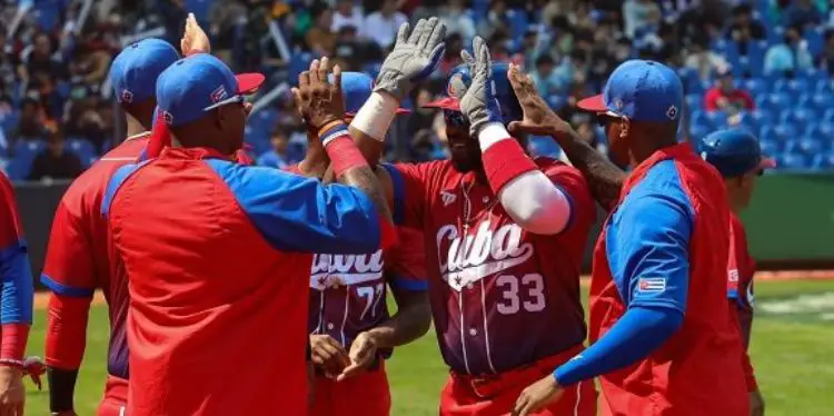
After reviewing the 20 costumes of the nations competing for the acclaimed trophy, they came to the conclusion that the teams from Great Britain (1), Puerto Rico (2) and Cuba (3) have the least attractive uniforms of the event.
Marc Carig, C. Trent Rosecrans, Nick Groke, and Kaci Borowski, among other editors at The Athleticthey say they made a “rigorously determined and really voted ranking of the best outfits from caps to belts”.
What did you think about the Cuban uniform?
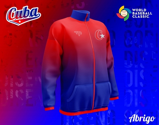
For Kamila Hinkson, the uniform of the Cuban team is “different.” The editor wonders if the outfit is “pretty in itself” and she quickly answers: “Probably not.” Hinkson doesn’t like the “red, white and blue” uniforms in general, she explained. Of course, she points out that she gave Cuba many points because she liked the “so strange gradient” that #TeamAsere wears.
On the other hand, Marc Carig’s criticism was devastating: “Are they a red team? Are they a blue team? Someone got pretty with the gradient and decided that Cuba would be both. The result is putrid.”
Nor were the words of C. Trent Rosecrans encouraging. The expert confessed that he held Cuba in higher esteem in baseball, but that the team had disappointed him with the uniform, not because he thought, he said, that it was a good uniform or it looked good, but because Cuba used to be “iconic.” The specialist thinks that even before the Classic, “Cuba had an international baseball identity with red or blue pants. It’s still here,” even though “it’s messed up,” he noted.
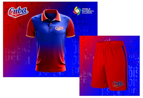
“[Cuba] It’s a lot like a European soccer team that has a basic identity, but has to change it every year to sell new jerseys,” he added.
Finally, he is encouraged to give some advice to those who are dedicated to designing Cuban uniforms: “The gradients never work on baseball uniforms. stop trying [Cuba].”
The culprits of the degradation
A note of the sports propaganda medium of the Cuban regime Hit point out the culprits.
“After months of hard work between JIT, INDER, the Cuban Baseball Federation (FCB) and the sponsor company TeamMate Sports International, today we can present the design line that these days is starting to leave the factory,” he published. Hit.
Before appearing the devastating criticism, the medium praised the design of the uniforms. In addition, he explained that with the predominance of the national colors (white, blue and red) and in emphasis on the gradient, the kit was “modern, attractive.”
ObviouslyThe Athletic have another opinion.
The ones that the critics liked
The outfit from Mexico ranked first in the evaluation and, in addition to delighting the critics, the fans also liked it as the uniform is almost sold out in New Era stores.
“Everything is perfect. The M on the cap comes from the logo of the 1968 Summer Olympics, when they were held in Mexico City,” said Nick Groke.
Craig, who hated the downgrading of Cuba, only had praise for Mexico: “Personally, I celebrate the entire catalog. The primary colors of the main uniforms are obvious. Red and green are so bold. That makes the clearest alternative seem like a perfect change.”

“El Tri (Mexican national team) has some of the best uniforms in international soccer each year and the baseball team continues that tradition. I love the identity of a national sports kit, especially one that is different from red, white and blue,” Rosecrans added.
Second place went to Australia, whose team decided to respect their traditions and colors. His uniform is green and sober.
In third place is the Japan team with a classic outfit that we will surely see until the last stages of this tournament, where they arrived as one of the favorites.




![[Video] Strong shooting occurred in the attempted robbery of a bank in Río de Oro, Cesar [Video] Strong shooting occurred in the attempted robbery of a bank in Río de Oro, Cesar](https://latin-american.news/wp-content/uploads/2023/03/Video-Strong-shooting-occurred-in-the-attempted-robbery-of-a-1024x599.jpg)
